Three ways to buy
Three fitness-goal tiles became three fulfilment paths: Ready Meals, Custom Prep, Bulk Packs. The menu now asks how you want your food prepared, which is the question checkout actually needs answered.
A Shopify rebuild for a meal-prep brand, organised around the three ways its customers actually buy. Daily orders went from around two to five.

Diet Monsta cooks for people who count protein: ready meals, custom plates built to your macros, and raw vacuum-sealed bulk packs. The catalog had outgrown a store that was built around marketing goals rather than how orders were actually packed and delivered.
I rebuilt it on my own, design and Shopify development, restructuring the catalog into three purchase paths and rebuilding the theme for speed.
The homepage hero.
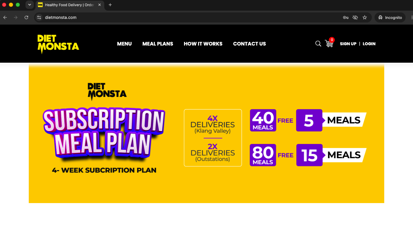
Before. A promo with no product and no reason to stay.
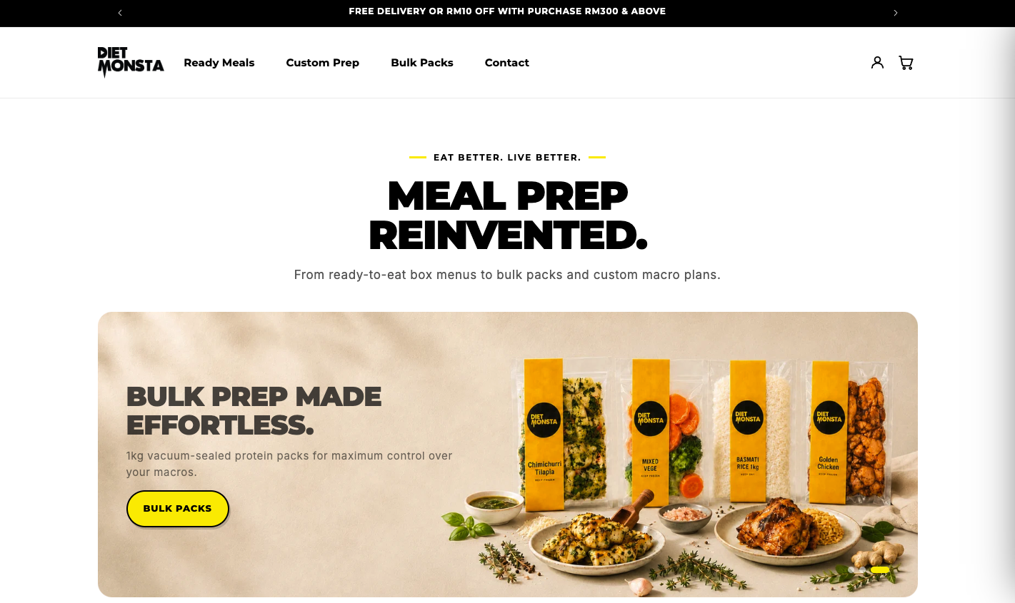
After. A concrete delivery threshold, a stated value prop, real food.
Nothing was obviously broken. It was slow, generic, and sorted by fitness goals (Muscle Gain, Weight Loss, Eat Well) that overlapped and mapped to no clear product. Macros were only legible up close. Placeholder thumbnails sat where the food should have been.
And the losses stacked. Anyone the homepage failed to convince never reached the menu, and the menu lost more before the cart.
A flat promo hero with no value proposition, no product photography, four generic how-it-works icons and a redundant Sign Up / Login nav.
Goal tiles with no matching products, macros buried in a photo overlay, no filters, no reviews, broken placeholder thumbnails.
A flat list with no bundle breakdown and no reason to add more. The minimum-pack rule stayed invisible, and two primary buttons competed for the same click.
“What’s fresh this month.” The same meals, read in a second instead of squinted at.
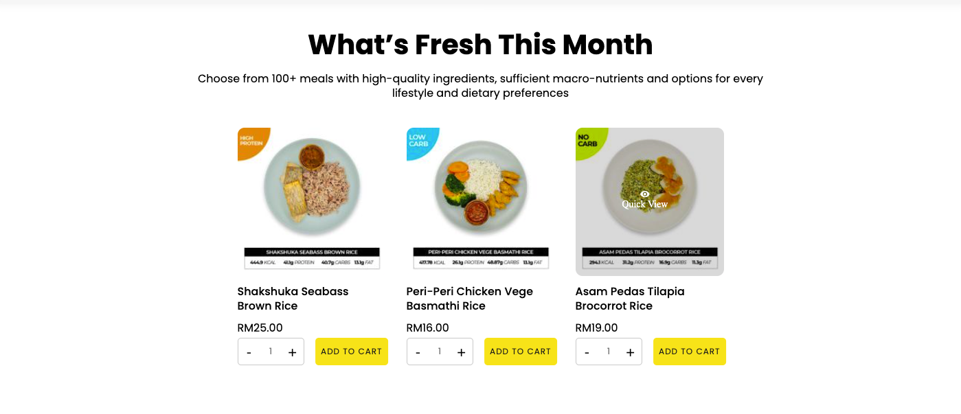
Before. Macros printed over the photo.
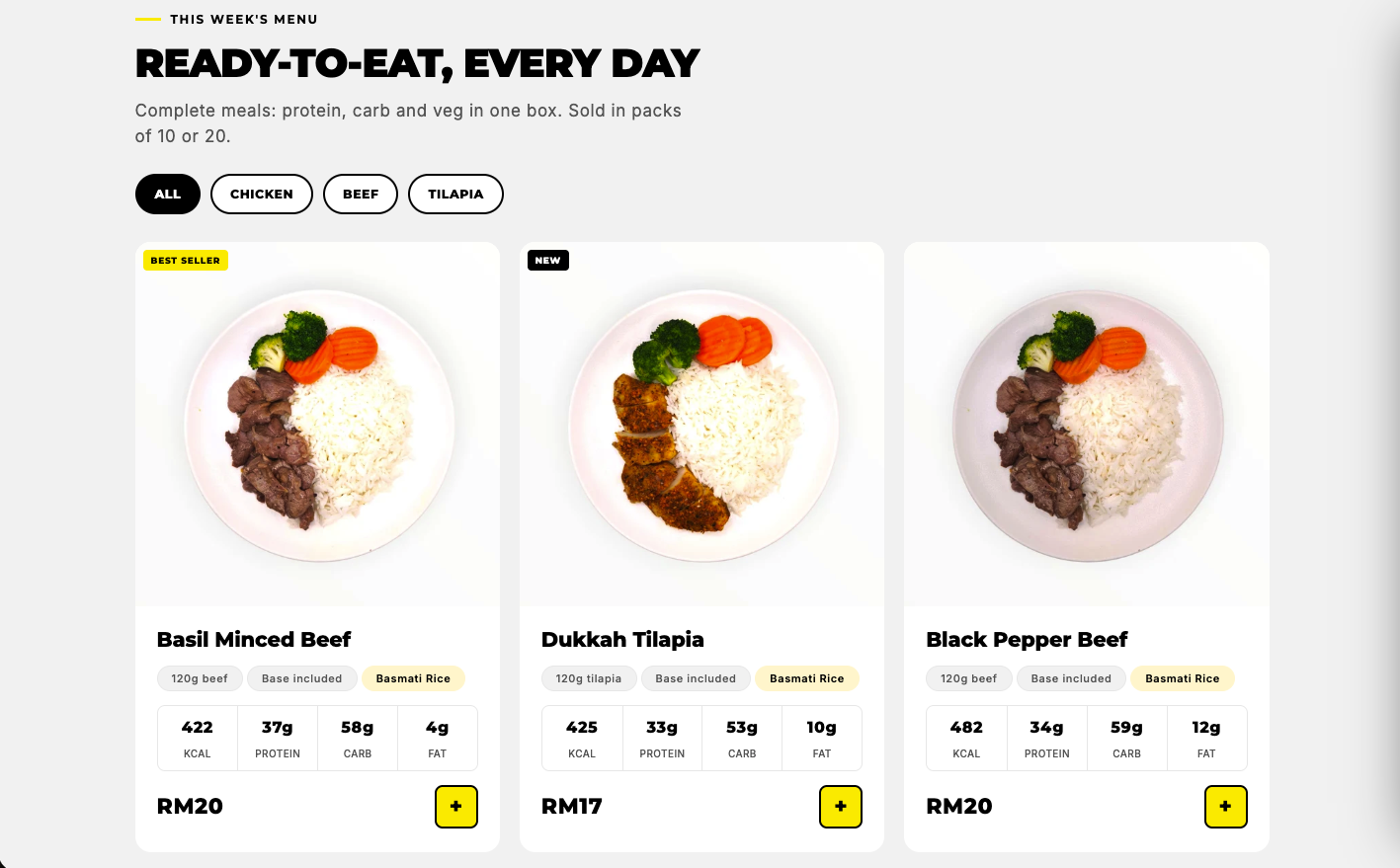
After. Macros in their own row, in tabular figures you can compare at a glance.
Each change answers something the old store kept from shoppers: a value prop it never stated, macros nobody could read, a minimum-order rule that only showed up at checkout.
The two that did most of the work
Three fitness-goal tiles became three fulfilment paths: Ready Meals, Custom Prep, Bulk Packs. The menu now asks how you want your food prepared, which is the question checkout actually needs answered.
The theme was rewritten in Liquid around real page weight. Desktop PageSpeed went from 30 to 94, mobile from 20 to 66, on the same URL. Every other fix depends on this one.
Then
A promo bar with a real threshold (free delivery or RM10 off from RM300), a headline that states the offer, and photography leading the new Bulk Packs line.
Macros lifted into a four-up grid, protein-type filters, and Best Seller and New markers where they help a decision.
A progress bar toward free delivery, with every Custom Prep plan itemised by protein, carb and veg.
The silent three-pack minimum became a pinned live summary: pack count, subtotal, and how many more to go.
The change everything else hangs off. Goals out, fulfilment paths in.
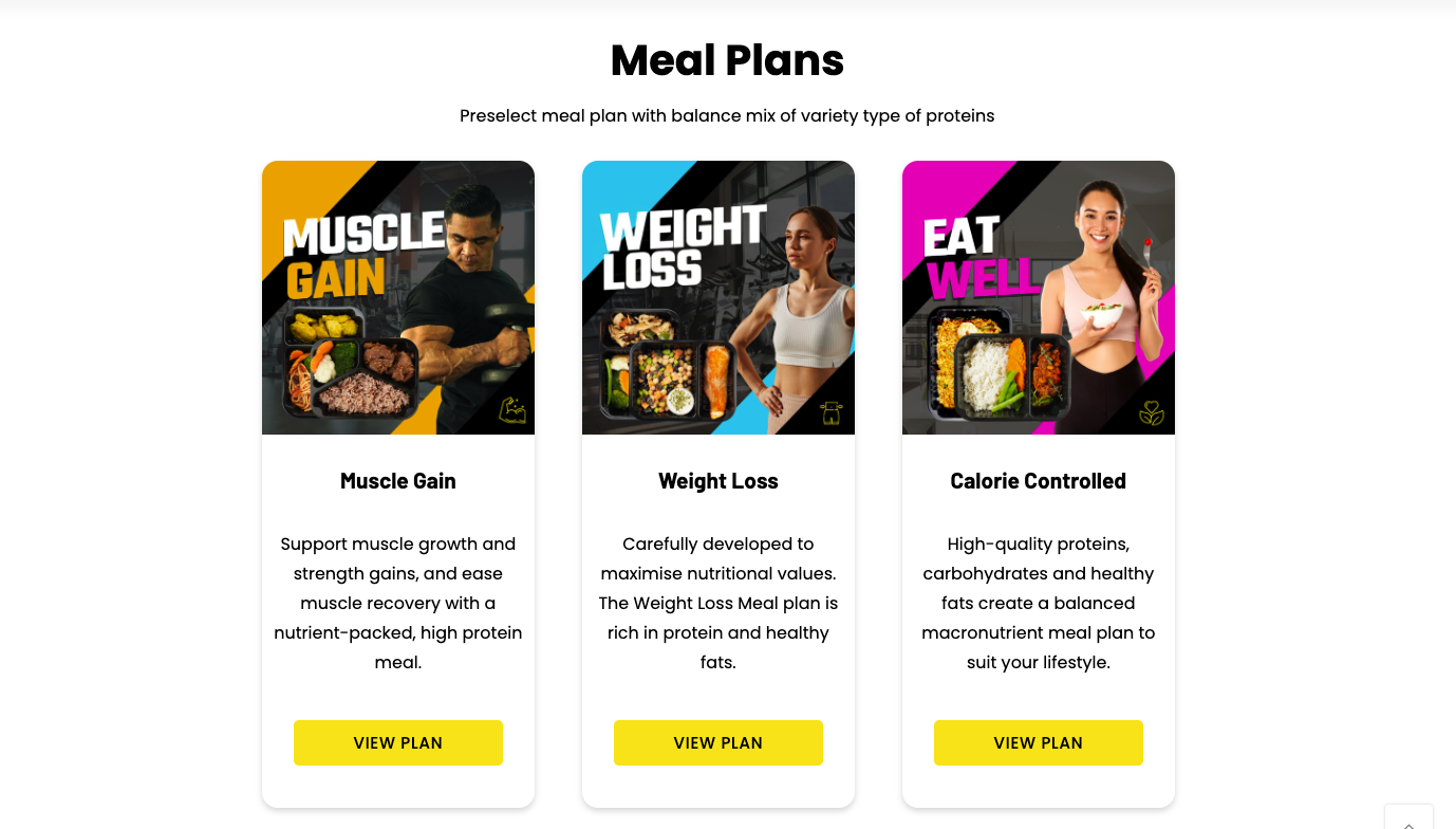
Before. Muscle Gain, Weight Loss, Eat Well.
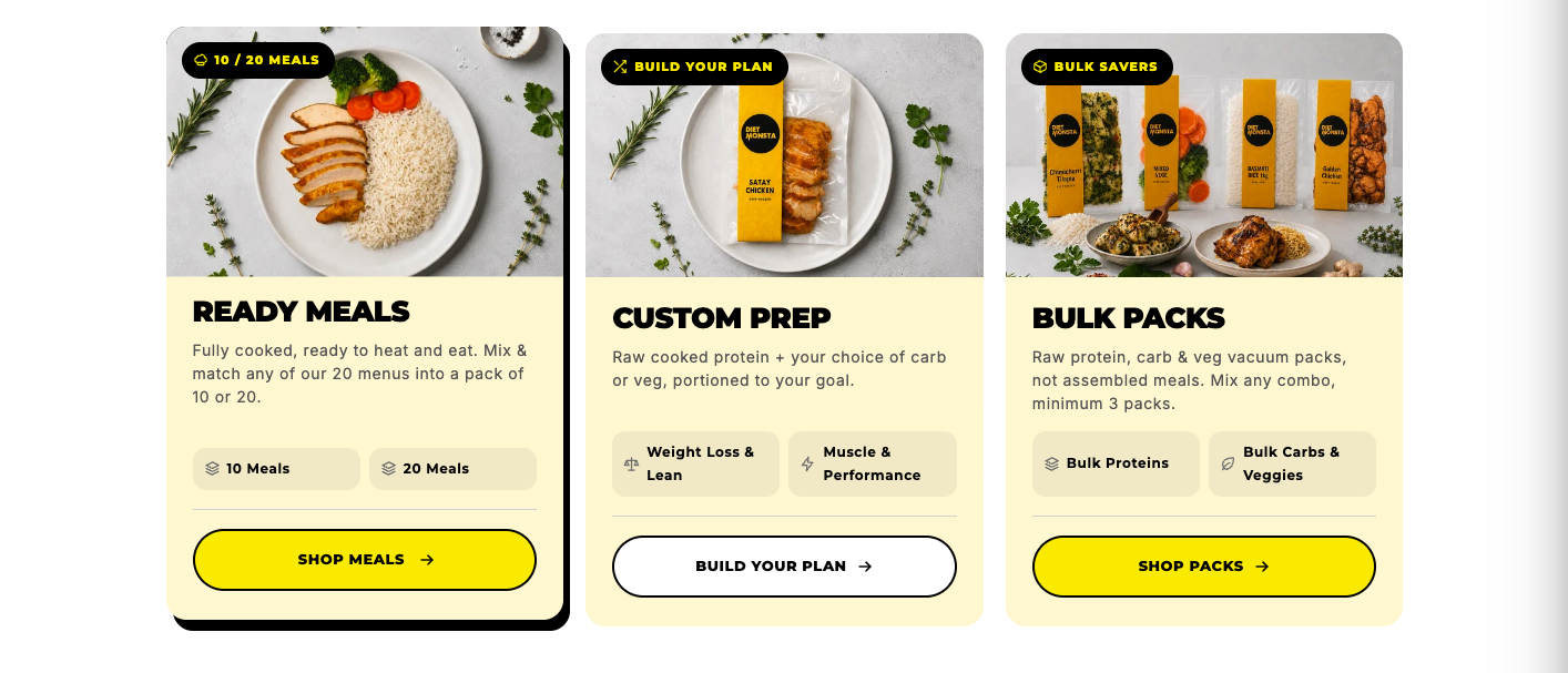
After. Ready Meals, Custom Prep, Bulk Packs.
Structure first, then speed. Everything else was detail.
Fulfilment detail, macros, delivery zones and the minimum-pack rule now sit on the screen where the decision happens. Nothing about the order is a surprise later.
How it works.
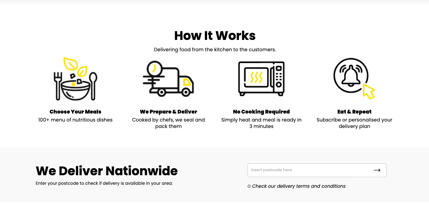
Before. Four icons that could belong to any shop.
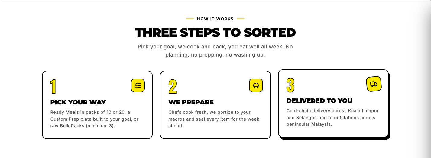
After. Three steps that name real pack sizes and delivery zones.
The cart drawer. An invisible checkout rule, turned into something you can see.
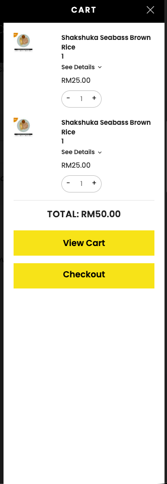
Before. No sense of what gets you free delivery.
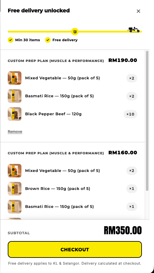
After. The threshold, visible and counting down.
The category page, rebuilt as a bundle builder.
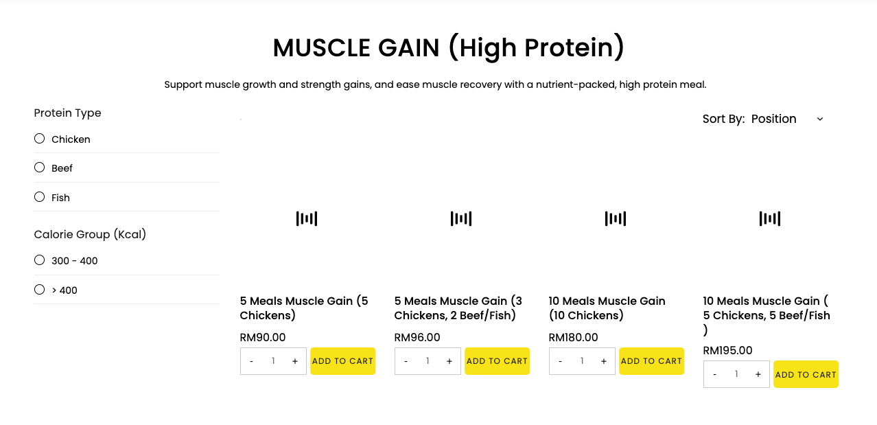
Before. A flat, unfiltered grid.
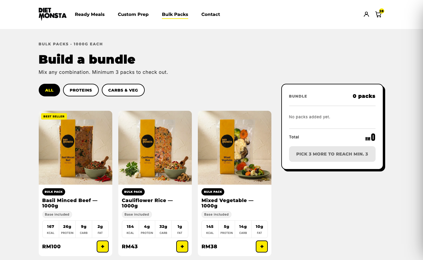
After. A bundle builder with filters and a pinned summary.
Most of the lift came from structure rather than styling. PageSpeed measured on pagespeed.web.dev, same URL before and after.
Hiring a designer who builds?
razaq.works@gmail.com