Product page, reordered
Benefits and social proof moved above the fold. People had been scrolling past the buy decision without ever seeing a reason to act.
A conversion audit and rebuild for a refillable personal-care brand. The traffic was already there. Purchases rose 70% once the store stopped getting in the way.
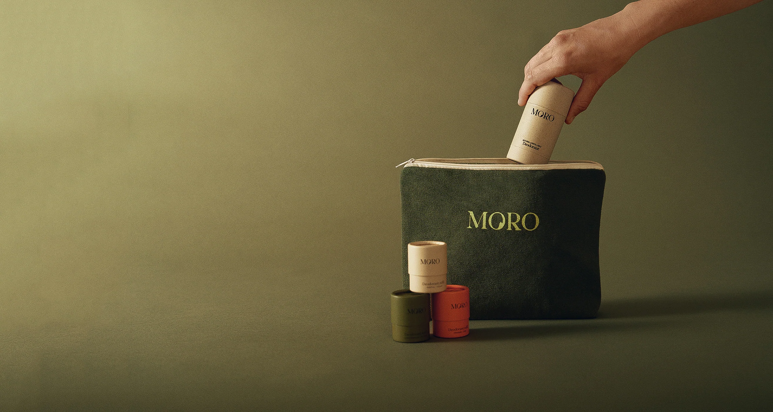
MORO Essentials is a Belgian brand built around refillable, low-waste personal care. As demand grew, the team noticed a widening gap between sessions and orders. The site looked right. Shoppers still left.
I led a conversion audit across the full purchase path, product page to cart to checkout, then designed and shipped the fixes myself in order of measured impact.
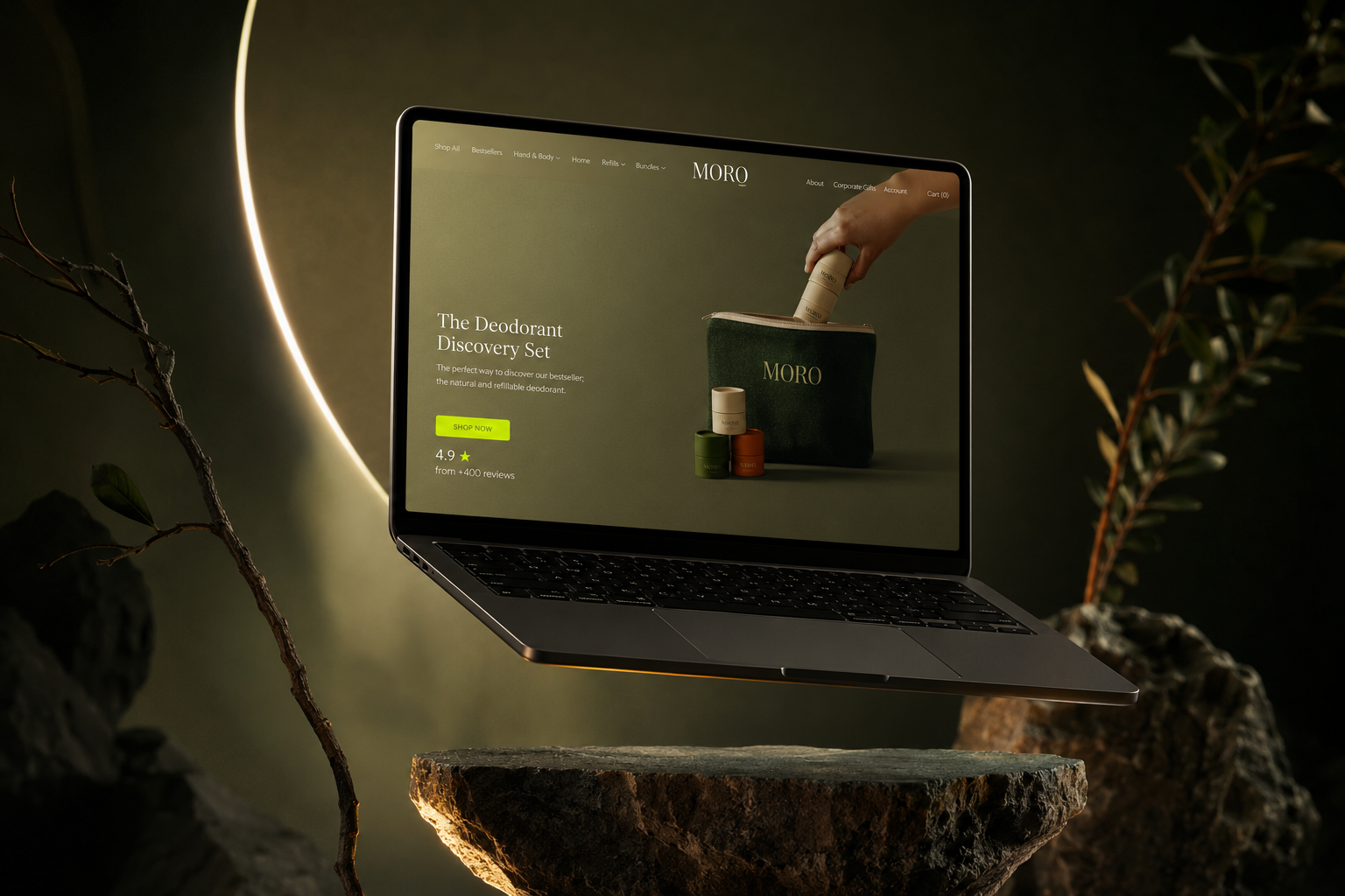
The rebuilt homepage and product page.
Session recordings and heatmaps told a consistent story. Visitors reached the product page, hesitated at the buy decision, and dropped at exactly the moments the interface held something back: price context, shipping cost, proof that anyone else had bought this.
And the problems stacked. Anyone the product page failed to convince never saw the cart at all.
A weak, low-contrast CTA, a confusing variant selector, benefits below the fold and no social proof in sight.
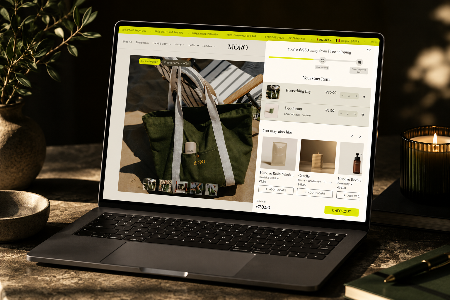
Delivery information hidden, a promo field that sent people off hunting for codes, no progress indicator, an unclear return policy.
Shipping fees that arrived as a surprise, no trust signals at payment, guest checkout hard to find, and a long form with no autofill.

Each change traces back to something I watched happen in the recordings: a rage click, a scroll that never reached the buy box, an exit on the shipping step.
The two that did most of the work
Benefits and social proof moved above the fold. People had been scrolling past the buy decision without ever seeing a reason to act.
A stronger add-to-cart button, fixed on mobile scroll, with nothing competing with it.
Then
Shipping estimate, returns and security cues placed where the decision happens, not in the footer where nobody looks.
Shipping costs shown early, the promo field played down, and the checkout button given proper weight.
Refill bundles framed as one clear offer instead of a variant grid that made a simple purchase feel like configuration.
Tap targets, legibility and spacing rebuilt across product and cart. Mobile was most of the traffic and the worst experience.
If I couldn't point to it in a recording, it didn't ship.
The starter kit, presented as one clear choice.
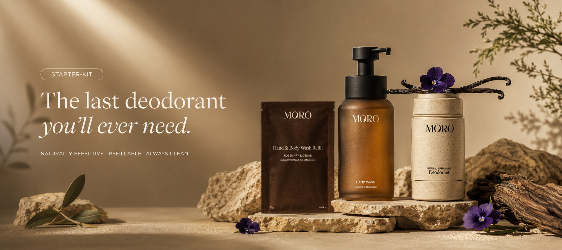
Proof, price, shipping and the refill upsell now live on one screen. The mock below works, so try it.
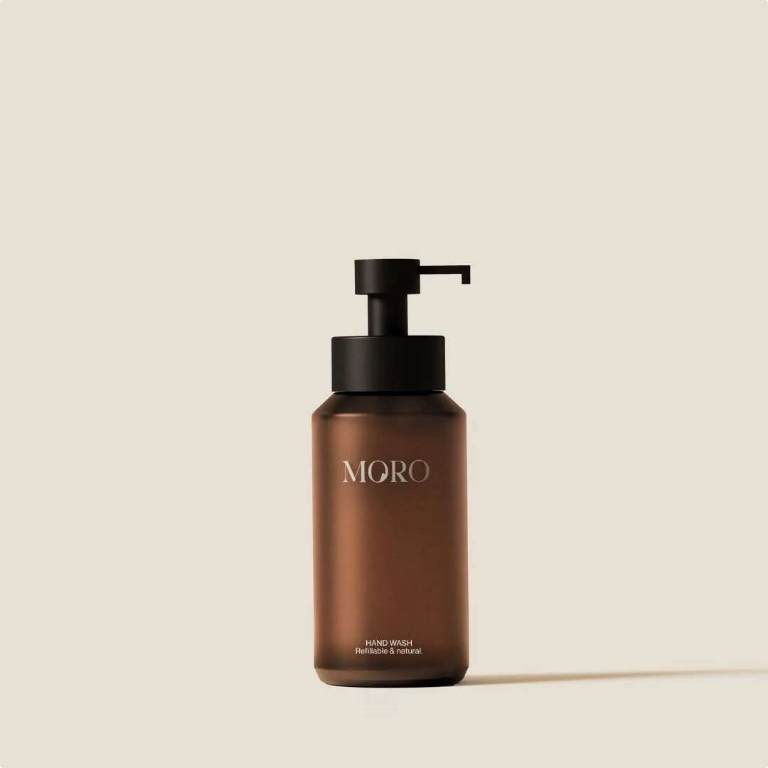
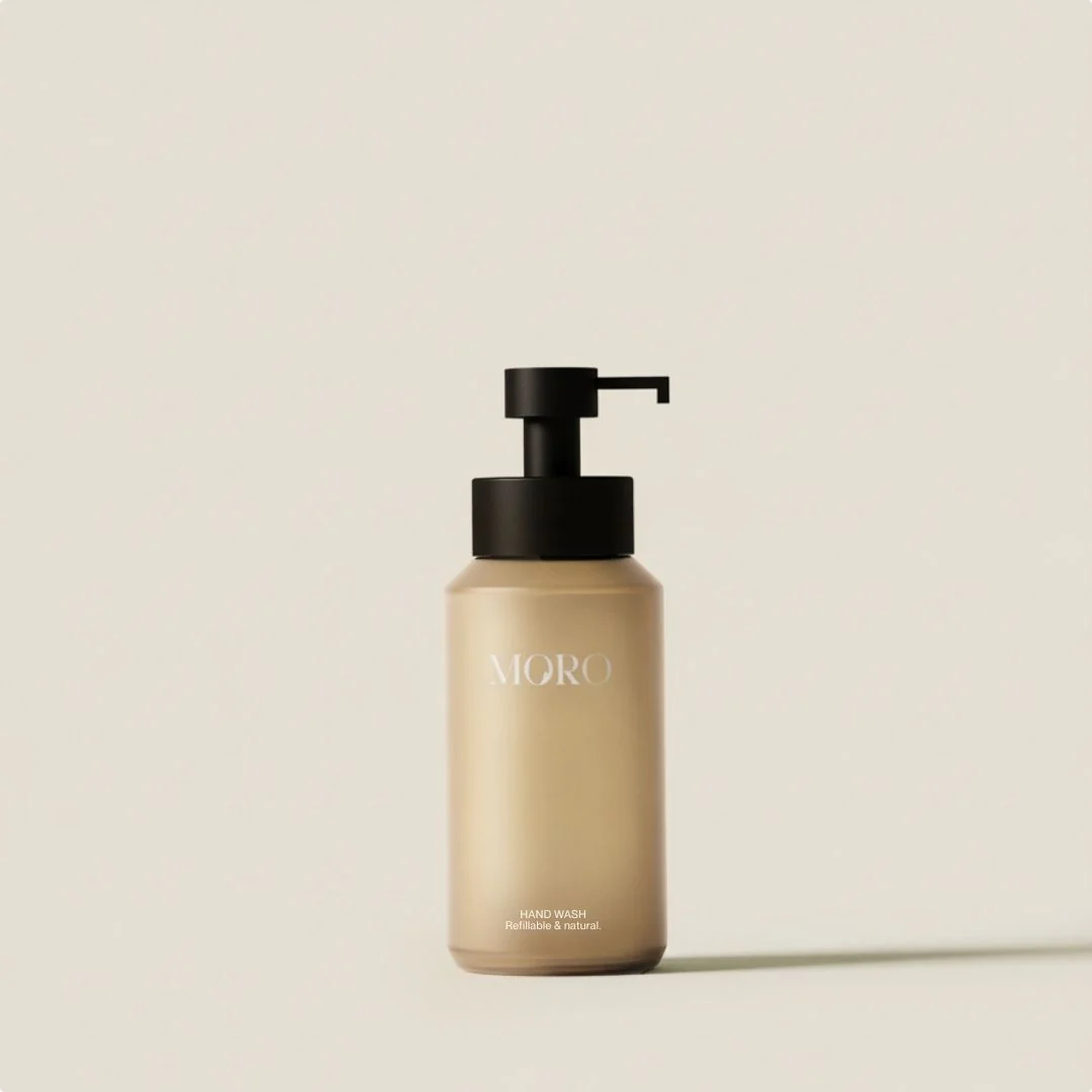
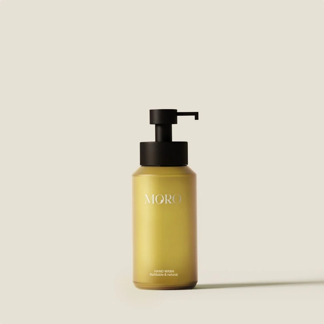
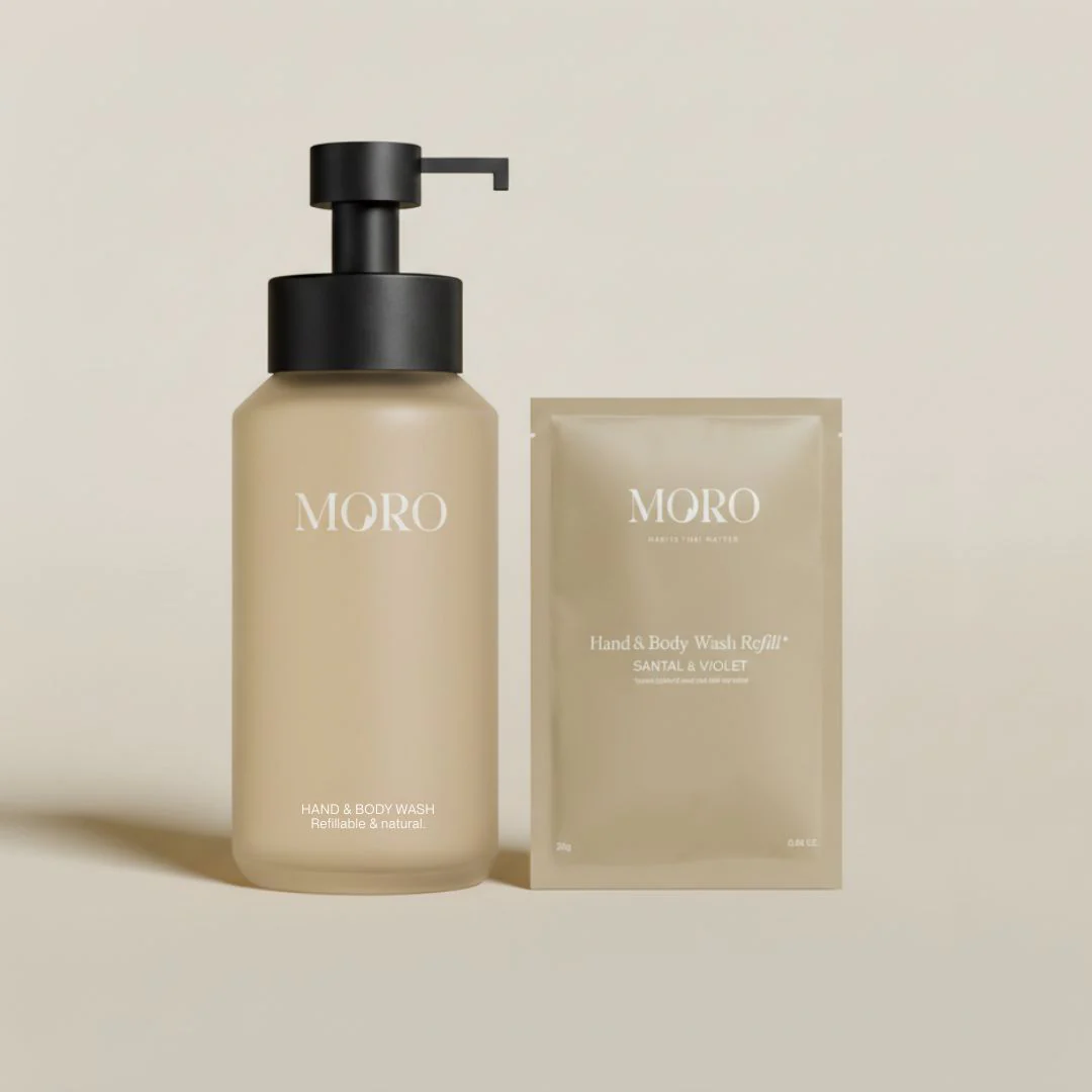
A refillable glass bottle plus your first two pouches. Designed to cut single-use plastic without changing your routine.
CitrusLavenderUnscentedPowder-to-gel formula. Add tap water, shake, and it's ready to use. Refillable glass bottle, designed to last.
98.5% natural origin. Free from sulfates, parabens, and microplastics.
Empty one pouch into the bottle, add 300ml of water, shake for 10 seconds.
A working recreation of the shipped product page.
May to July 2025. MORO Essentials Shopify store, Belgium. Research with Hotjar, Microsoft Clarity and GA4.

Hiring a designer who builds?
razaq.works@gmail.com